Motion direction & type design
JAPAN AIRLINES
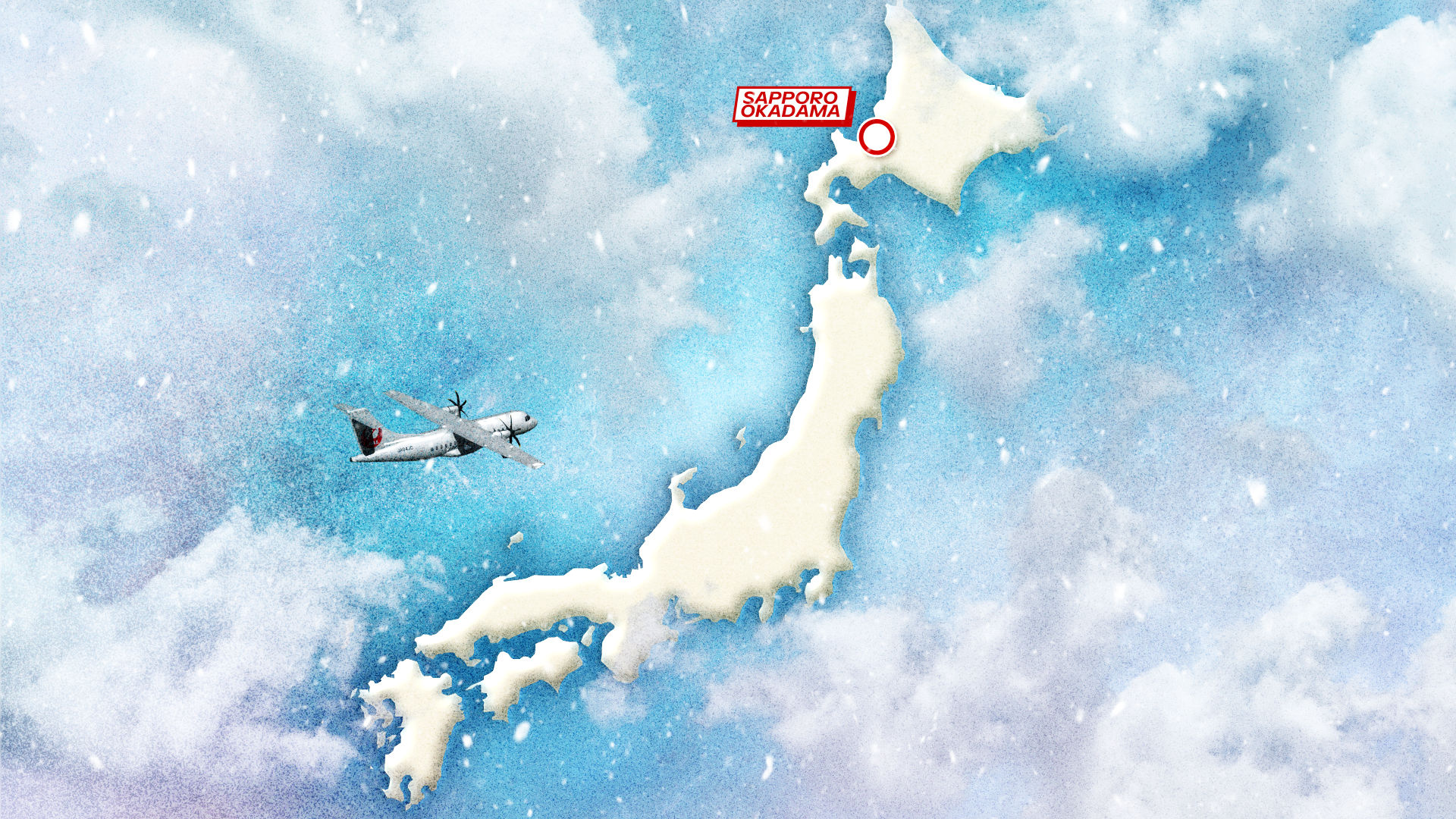
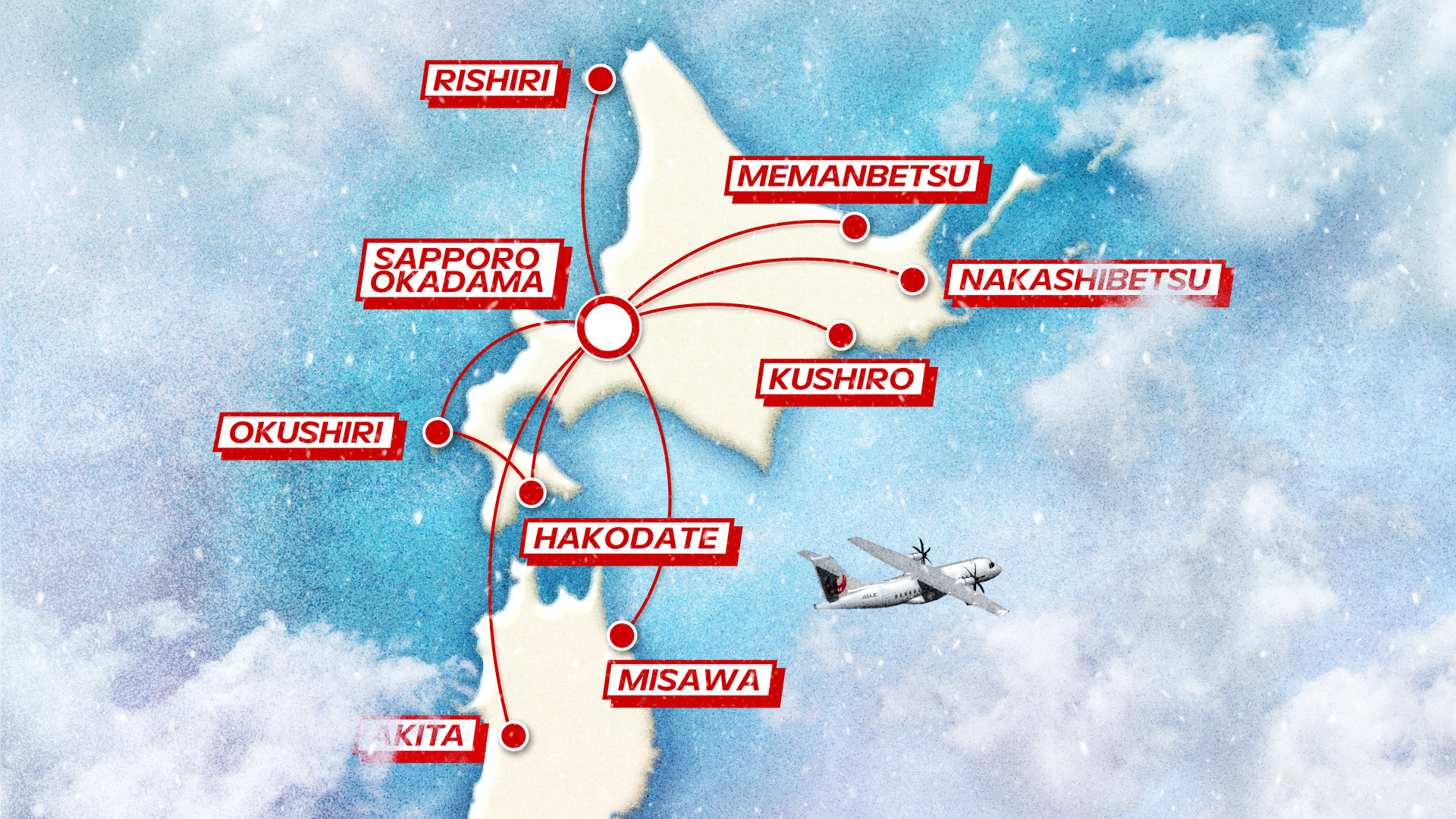
Our task was to bring to life the graphic design for Japan Airlines’ ‘Fly to Hokkaido’ campaign.
The brief called for restraint, so we built the motion around clarity. Clean transitions, legible typography, and a rhythm that lets the destination do the talking — everything designed to guide the viewer rather than compete with the image.
-
CLIENT — Japan Airlines
AGENCY — Dmbz
SERVICES — Creative Direction, Motion graphics
TEAM — Producer David Dicembre — Director, DP, Editor Issam Kéchouri — B cam Majin Tikal — Color grading Cody L Sandberg — Sound design Romain Guedj
Naturally, the Japanese macaques are under the spotlight for this campaign!
Here are some of the designs we proposed that were not ultimately retained by the client.